👋 Hi, I’m Dmitry Trostin. I’ve been designing for more than twenty years — interfaces, design systems, and visual identities.
I'm here to help you make complex things simple and fun.
Flamingo
01
Main Screen
01
Main Screen
Flamingo
App
Web
Role
Founding Designer
Role
Founding Designer
Role
Founding Designer
Tags
Travel Tracking
iOS App
Landing Page
Tax Residency
Visas
Tags
Travel Tracking
iOS App
Landing Page
Tax Residency
Visas
Tags
Travel Tracking
iOS App
Landing Page
Tax Residency
Visas
Scope
iOS App Design
Landing Page
Icon
Design System
Scope
iOS App Design
Landing Page
Icon
Design System
Scope
iOS App Design
Landing Page
Icon
Design System
Contribution
Product design, marketing website, App Store screenshots, app icon. Prototyping of key user flows.
Contribution
Product design, marketing website, App Store screenshots, app icon. Prototyping of key user flows.
Contribution
Product design, marketing website, App Store screenshots, app icon. Prototyping of key user flows.
Challenge
The app already had an early version. Basic features, nothing fancy, but enough to gather a stable user base.
The team wanted to grow the product far beyond that version, yet the existing design held everything back. It simply couldn’t scale.
Challenge
The app already had an early version. Basic features, nothing fancy, but enough to gather a stable user base.
The team wanted to grow the product far beyond that version, yet the existing design held everything back. It simply couldn’t scale.
Challenge
The app already had an early version. Basic features, nothing fancy, but enough to gather a stable user base.
The team wanted to grow the product far beyond that version, yet the existing design held everything back. It simply couldn’t scale.


Approach
I proposed a full redesign. It wasn’t an easy move because long-time users usually push back when everything shifts at once.
I suggested a new dashboard built around cards. Each card could fold into a bottom sheet, and that sheet could stretch to full screen when needed. Colors helped users spot the right card fast. The team liked the idea, so we went ahead and rebuilt the product.
Results
A year after we kicked off the redesign, the first new version went live. The actual design work took about three months. Users stayed. The launch went smoothly, and core metrics have been climbing ever since.
Results
A year after we kicked off the redesign, the first new version went live. The actual design work took about three months. Users stayed. The launch went smoothly, and core metrics have been climbing ever since.
Results
A year after we kicked off the redesign, the first new version went live. The actual design work took about three months. Users stayed. The launch went smoothly, and core metrics have been climbing ever since.
Fun Fact
One part of the audience includes high-net-worth users. People with yachts and private jets who use the app to manage their tax residency.
The app doesn’t store that level of personal data. They reach out directly with feedback and feature requests.
Fun Fact
One part of the audience includes high-net-worth users. People with yachts and private jets who use the app to manage their tax residency.
The app doesn’t store that level of personal data. They reach out directly with feedback and feature requests.
Fun Fact
One part of the audience includes high-net-worth users. People with yachts and private jets who use the app to manage their tax residency.
The app doesn’t store that level of personal data. They reach out directly with feedback and feature requests.


Four Stones Foundation
01
Logotype Presentation
01
Logotype Presentation
Four Stones Foundation
01
Logotype Presentation
Four Stones Foundation
Logotype
Role
Graphic Designer
Role
Graphic Designer
Role
Graphic Designer
Tags
Investment
Identity
Branding
Logotype
Tags
Investment
Identity
Branding
Logotype
Tags
Investment
Identity
Branding
Logotype
Scope
Logotype
Basic Identity
Scope
Logotype
Basic Identity
Scope
Logotype
Basic Identity
Background
The client came in with a compelling concept. Four stones, each representing a core value of the brand:
① Land
② Communities
③ Crypto
④ Jurisdiction
Background
The client came in with a compelling concept. Four stones, each representing a core value of the brand:
① Land
② Communities
③ Crypto
④ Jurisdiction
Background
The client came in with a compelling concept. Four stones, each representing a core value of the brand:
① Land
② Communities
③ Crypto
④ Jurisdiction
Challenge
Branding investment funds is always tricky. A fund can invest in anything. Real estate today, biotech tomorrow.
The identity had to feel flexible enough to follow the market, shift direction, anticipate change. At the same time, it needed to project stability and weight.
That balance is hard to strike. Expressing something fluid yet solid is the core contradiction behind this kind of work.
Solution
The four circles represent the stones, coming together into one simple and coherent mark.
Elegant, universal, built to last. To demonstrate how the logo could grow into a full identity, I created basic motion and narrative elements and wrapped everything in a short showreel for presentation.
Maison Art
01
Artworks
01
Artworks
Maison Art
01
Artworks
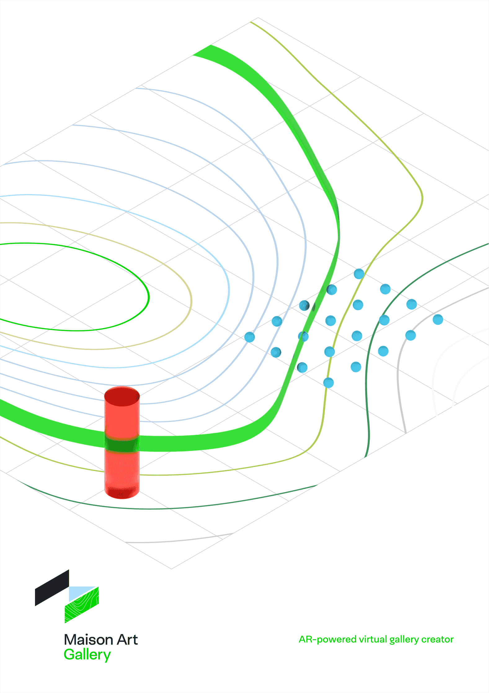
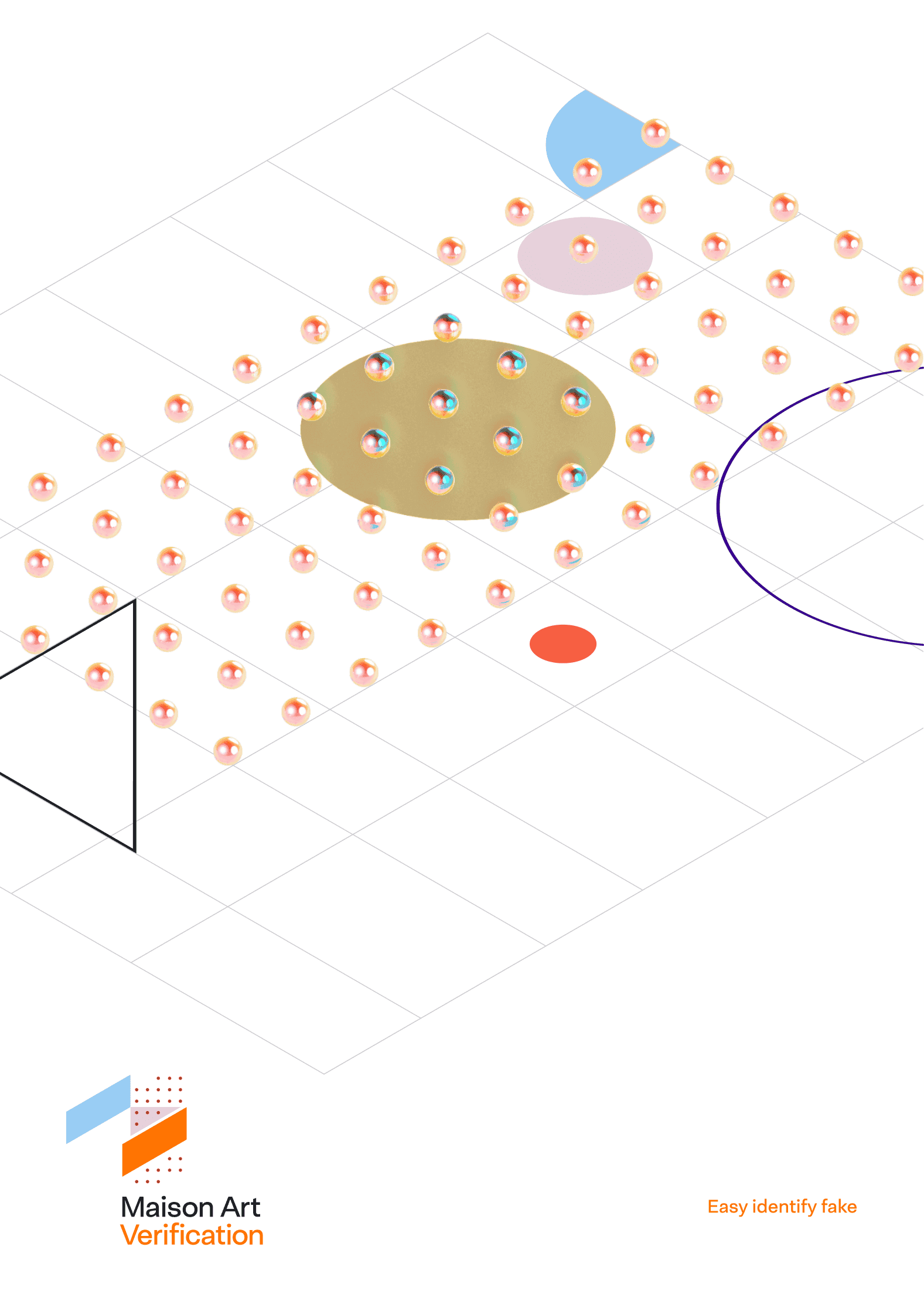
Maison Art
0→1
SaaS
Identity
Product Design
Web Design
Role
Founding Designer
Role
Founding Designer
Role
Founding Designer
Tags
SaaS
Art Management
Tags
SaaS
Art Management
Tags
SaaS
Art Management
Scope
0→1
Design Strategy
Identity
Product Design
Web Design
Scope
0→1
Design Strategy
Identity
Product Design
Web Design
Scope
0→1
Design Strategy
Identity
Product Design
Web Design
Contribution
Whole design scope from 0 → launch. Brand identity, product UX/UI, design system, and marketing site.
Contribution
Whole design scope from 0 → launch. Brand identity, product UX/UI, design system, and marketing site.
Contribution
Whole design scope from 0 → launch. Brand identity, product UX/UI, design system, and marketing site.


Fun Fact
Tattoo artists use the system too.
Fun Fact
Tattoo artists use the system too.
Fun Fact
Tattoo artists use the system too.
Background
There are a few tools on the market for managing art collections. All of them are outdated and overpriced. The client wanted to change that.
Background
There are a few tools on the market for managing art collections. All of them are outdated and overpriced. The client wanted to change that.
Background
There are a few tools on the market for managing art collections. All of them are outdated and overpriced. The client wanted to change that.
Approach
A design system is far more than just differently styled buttons and inputs. I formulated several core principles that underpin every screen of the web application.
Approach
A design system is far more than just differently styled buttons and inputs. I formulated several core principles that underpin every screen of the web application.
Approach
A design system is far more than just differently styled buttons and inputs. I formulated several core principles that underpin every screen of the web application.
Consistency
Basic patterns and mechanics are uniform across all screens.
Add buttons are always located in the top-right corner, regardless of the entity being displayed.
The search bar is always positioned at the top above the list, whether the user is browsing artworks, exhibitions, or artist directories.
Every entity related to an artist’s content has a contextual menu, mirrored in a submenu at the bottom when navigating deeper into that entity’s screen.
Scalability
The interface is designed to function seamlessly for both individual artists with five artworks and galleries managing thousands. The transition from a beginner user to a “pro” user should naturally retain familiar habits.
The interface works across both desktop and touch devices. This means no mechanics should rely solely on hover interactions, and the tappable area for controls must not be smaller than 44pt.
Interface Monotony
Functionality is never duplicated across different parts of the system.
Identical functionality always operates through the same mechanism.
Interface Monotony
Functionality is never duplicated across different parts of the system.
Identical functionality always operates through the same mechanism.
Interface Monotony
Functionality is never duplicated across different parts of the system.
Identical functionality always operates through the same mechanism.
Content Over Interface
Simplicity and clarity are prioritized in the interface.
The interface should never detract from the visual perception of the artworks.
Content Over Interface
Simplicity and clarity are prioritized in the interface.
The interface should never detract from the visual perception of the artworks.
Content Over Interface
Simplicity and clarity are prioritized in the interface.
The interface should never detract from the visual perception of the artworks.
Critical Actions Are Reversible
For example, a deletion toast notification. Instead of interrupting the user with a pointless “Are you sure?” prompt, it’s often better to provide an option to undo the action
Critical Actions Are Reversible
For example, a deletion toast notification. Instead of interrupting the user with a pointless “Are you sure?” prompt, it’s often better to provide an option to undo the action
Critical Actions Are Reversible
For example, a deletion toast notification. Instead of interrupting the user with a pointless “Are you sure?” prompt, it’s often better to provide an option to undo the action


Takeaways
Started with a full-featured iPad app. It didn’t take off, so we shifted focus to web.
Takeaway
Started with a full-featured iPad app. It didn’t take off, so we shifted focus to web.
Takeaways
Started with a full-featured iPad app. It didn’t take off, so we shifted focus to web.
Solution
The design stays out of the artwork’s way. What we ended up with is highly scalable, built on familiar patterns. I’m especially happy with how affordances work in collections and exhibitions.
Solution
The design stays out of the artwork’s way. What we ended up with is highly scalable, built on familiar patterns. I’m especially happy with how affordances work in collections and exhibitions.
Solution
The design stays out of the artwork’s way. What we ended up with is highly scalable, built on familiar patterns. I’m especially happy with how affordances work in collections and exhibitions.
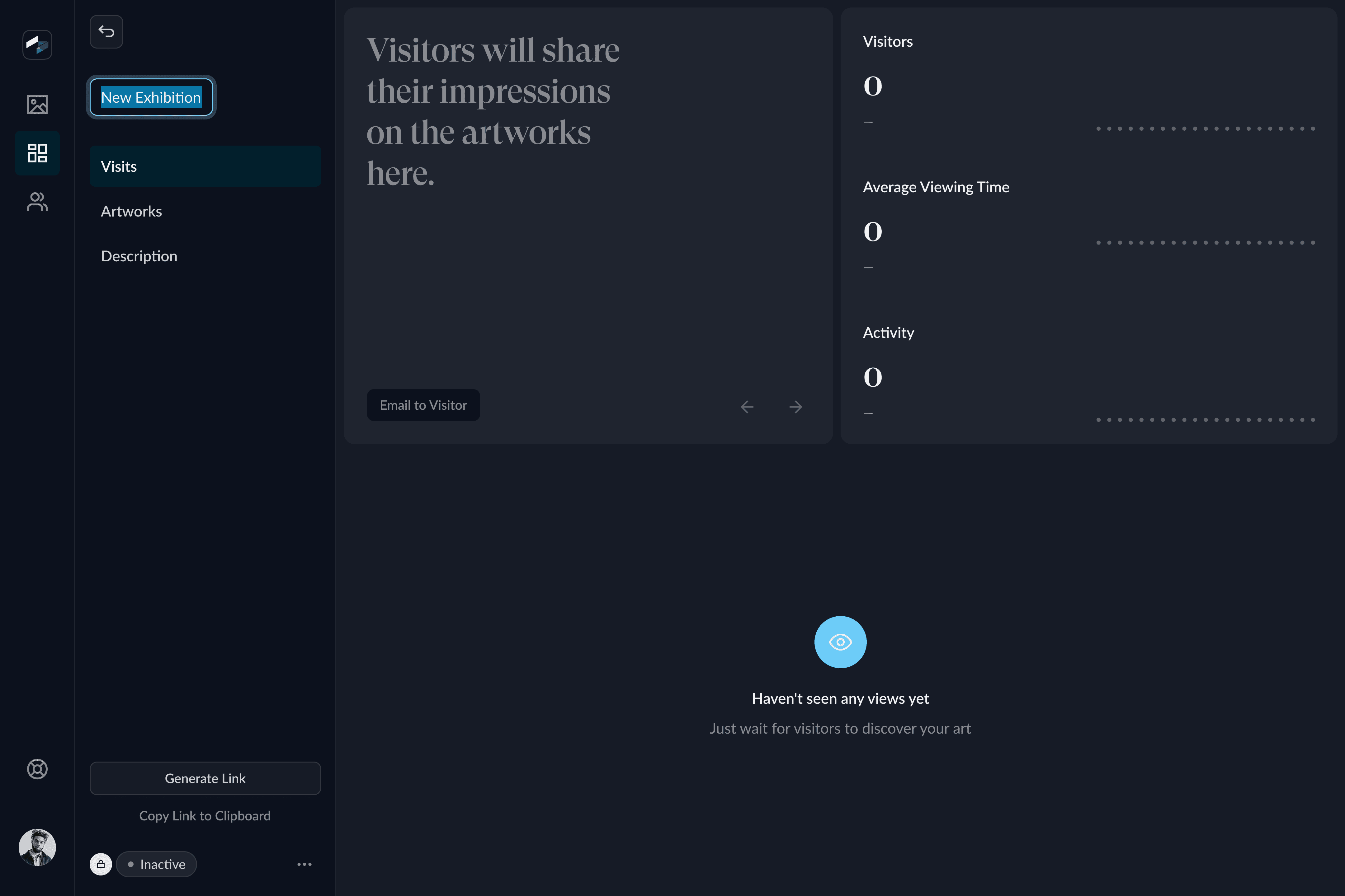
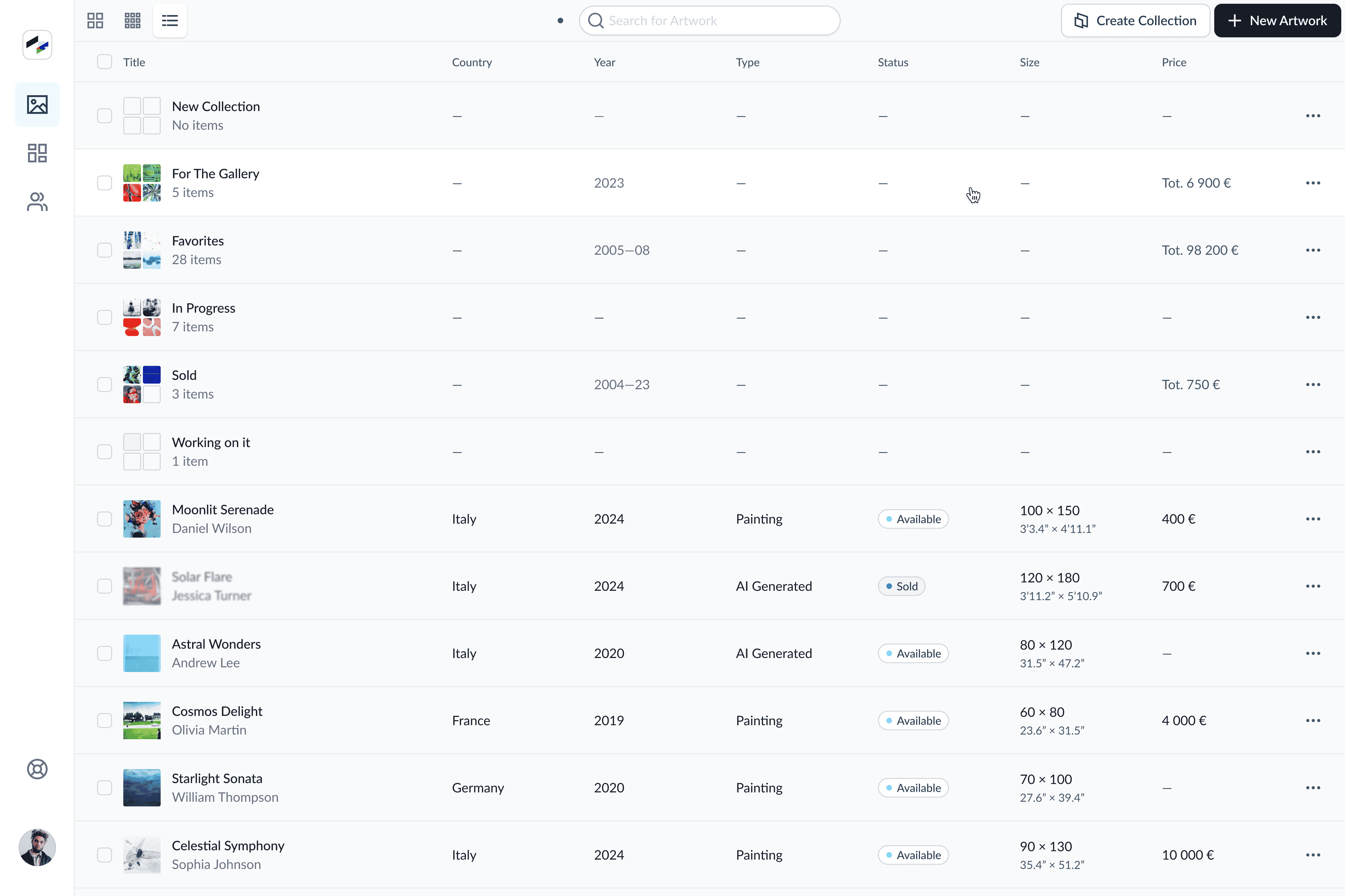
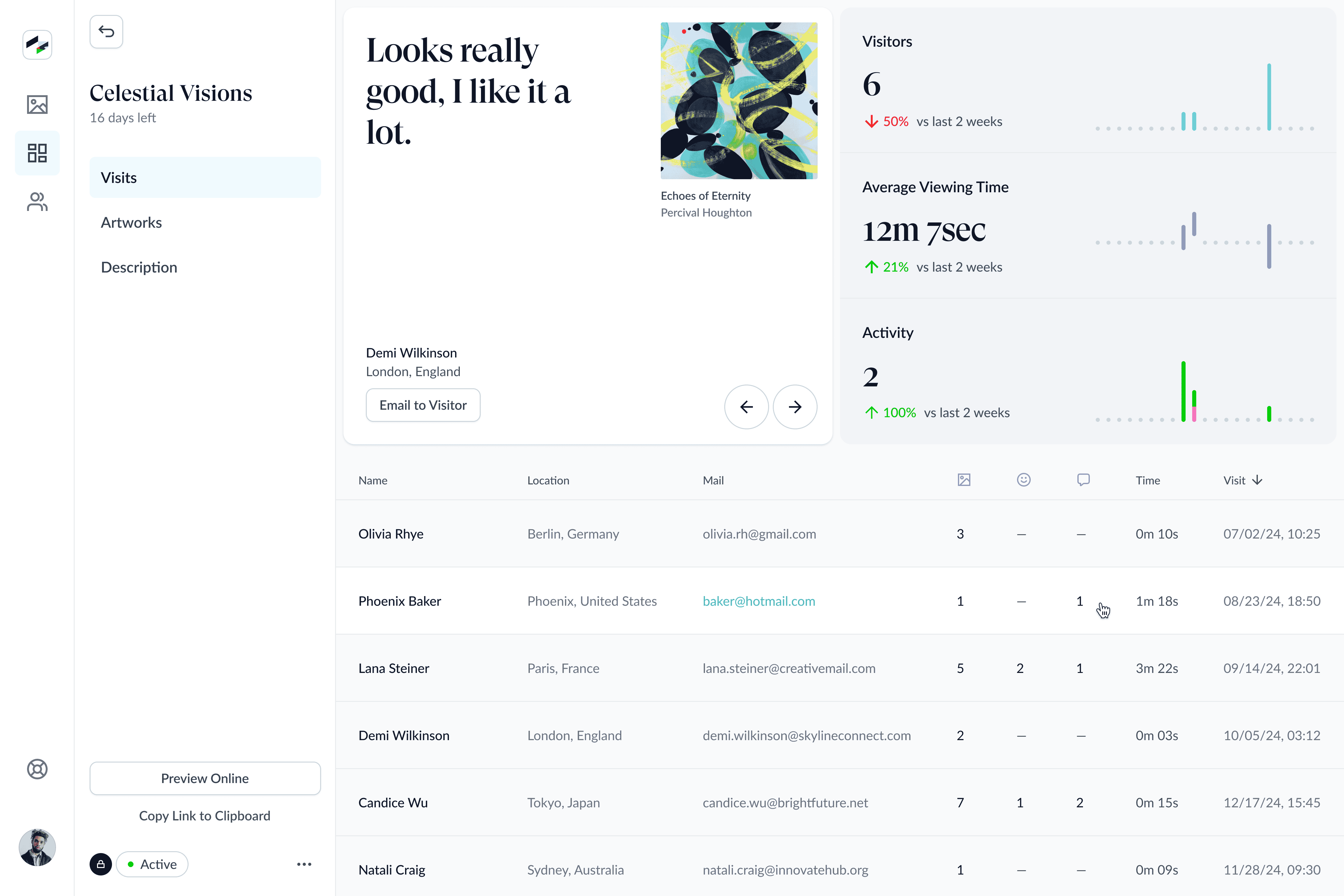
Key Features of the Project
Drag & Drop functionality in the exhibition interface.
Target audience: independent, relatively unknown artists. The idea is that meaningful feedback from buyers is more motivating than occasional statistics.
Dark theme.
Responsive design
Dashboard with statistics across all exhibitions.
Multi-entity selection.
Collection creation.
Contextual menus.
Renaissance Health
01
Title
01
Title
Renaissance Health
01
Title
Renaissance Health
0→1
SaaS
Design Language
Design System

Role
Principal Product Designer
Role
Principal Product Designer
Role
Principal Product Designer
Tags
Health Tech
Insurance
Dashboard
Chat
Video Calls
Authentic
Tags
Health Tech
Insurance
Dashboard
Chat
Video Calls
Authentic
Tags
Health Tech
Insurance
Dashboard
Chat
Video Calls
Authentic
Scope
Concept
Design System
Product Design
Sound Design
Scope
Concept
Design System
Product Design
Sound Design
Scope
Concept
Design System
Product Design
Sound Design
Contribution
Full product design. Information architecture planning, resilient interaction patterns, user flows, design system development, product UI and UX.
Contribution
Full product design. Information architecture planning, resilient interaction patterns, user flows, design system development, product UI and UX.
Contribution
Full product design. Information architecture planning, resilient interaction patterns, user flows, design system development, product UI and UX.
Challenge
Renaissance Health is part of the Renaissance Insurance Group. At the start, the division had only a logo, a basic identity, and tens of thousands of clients who had been using the service exclusively via phone.
The task was to create a full-scale digital product from scratch, under serious time pressure.
Approach
Once we defined the MVP’s core functionality and scenarios, we decided to stay aligned with the visual language inherited from the parent group. Geometric shapes. Bold, saturated colors.
The first two concepts didn’t click. They were scalable and functional, but the vibe wasn’t right. The design team felt we could push further and had to aim higher.
The third concept was the one. Visually authentic, clearly differentiated in the market, yet grounded in and expanding on the Renaissance brand language.
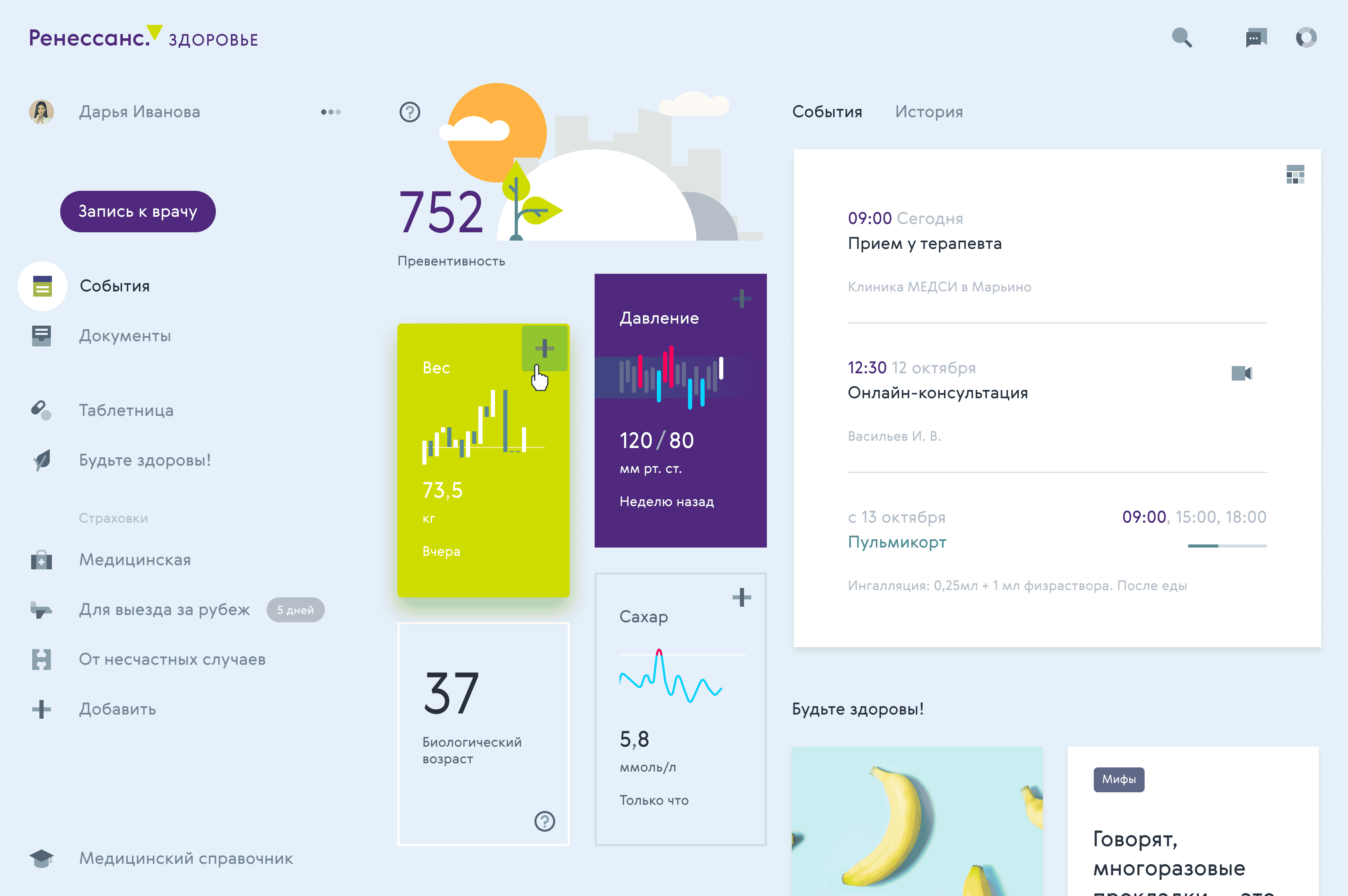
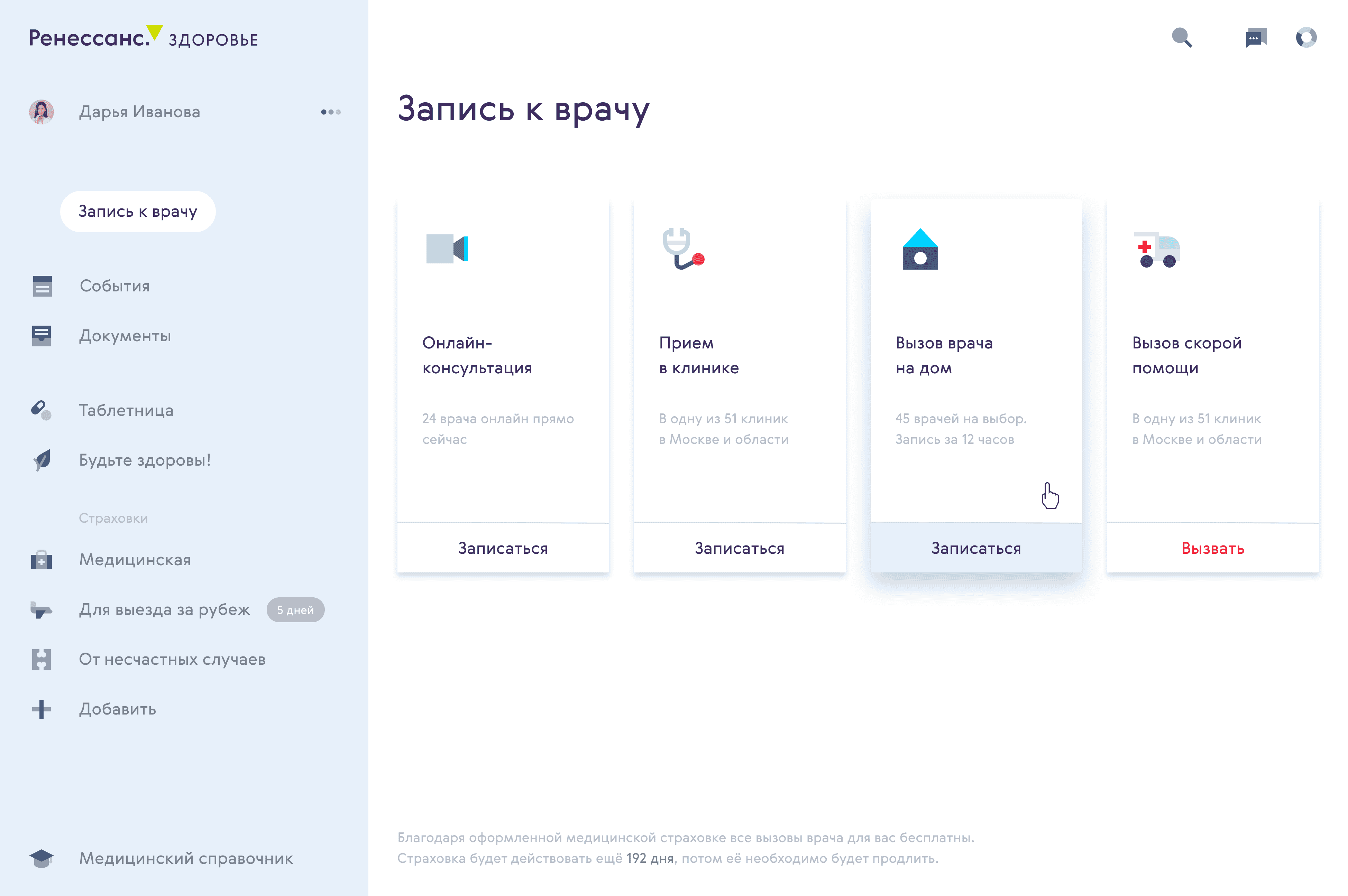
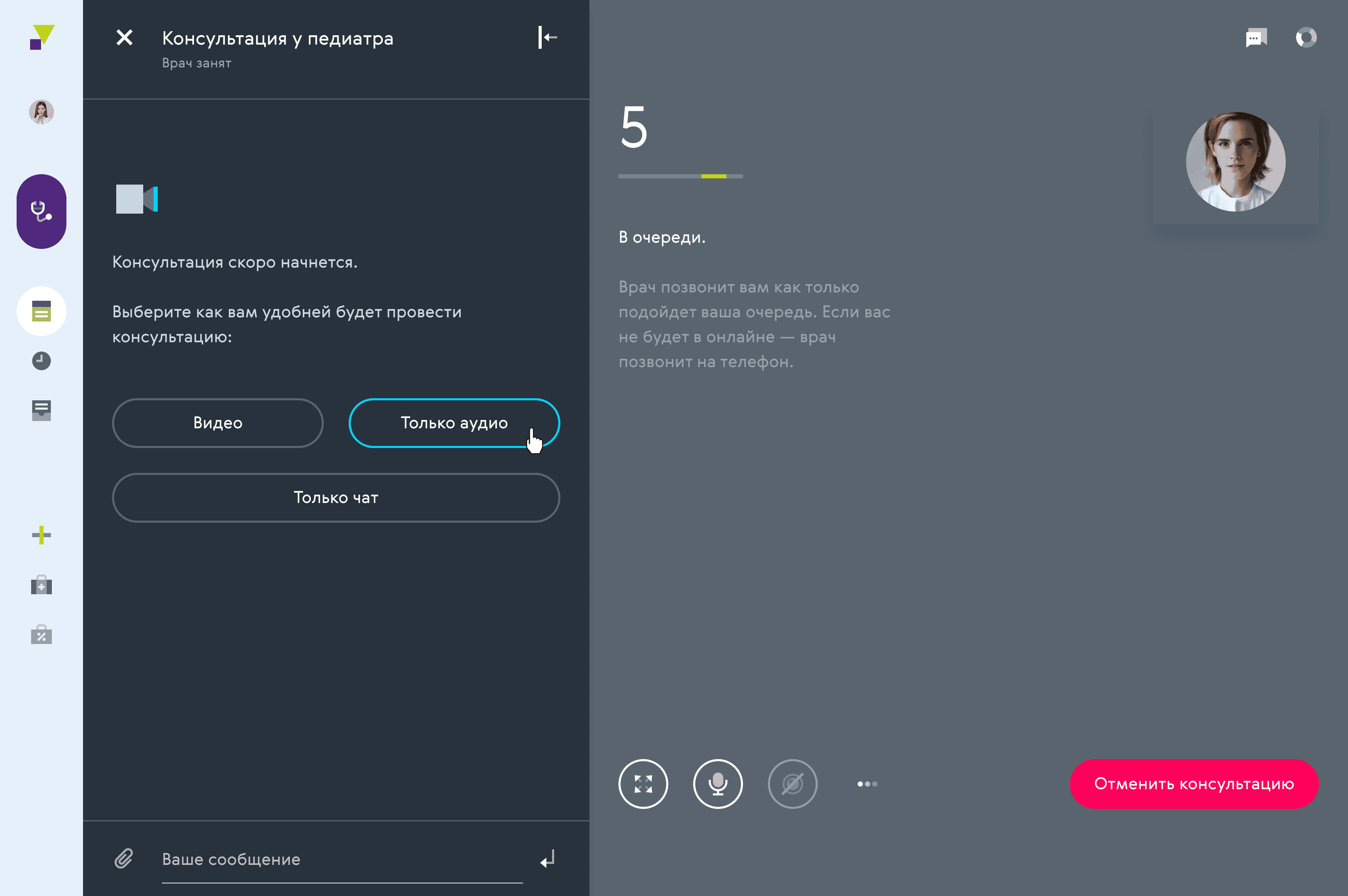
Results
The MVP launched 6 months after the project began.
We designed and shipped a fully responsive web interface with appointment booking, online consultations, document storage, financial tools, chat, and more.
The design system covered principles, grids, typography, color, iconography, patterns, and even sound.
Thank you, come again!
Thank you, come again!
Thank you, come again!
Wow!
I really didn’t expect you to scroll all the way to the end.
Thank you! Wanna talk about your project?
Wow!
I really didn’t expect you to scroll all the way to the end. Thank you! Wanna talk about your project?
Wow!
I really didn’t expect you to scroll all the way to the end.
Thank you! Wanna talk about your project?